
How to Design Feather Flags That Attract More Customers
Effective feather flag design starts with a message that can be understood quickly inside a tall, narrow outline. Use a recognisable company emblem and only the wording needed for that location. An attractive screen layout is not enough: check the actual template, seams, viewing distance and reverse appearance. The aim is a clear display, rather than a promise that a particular design will produce sales.
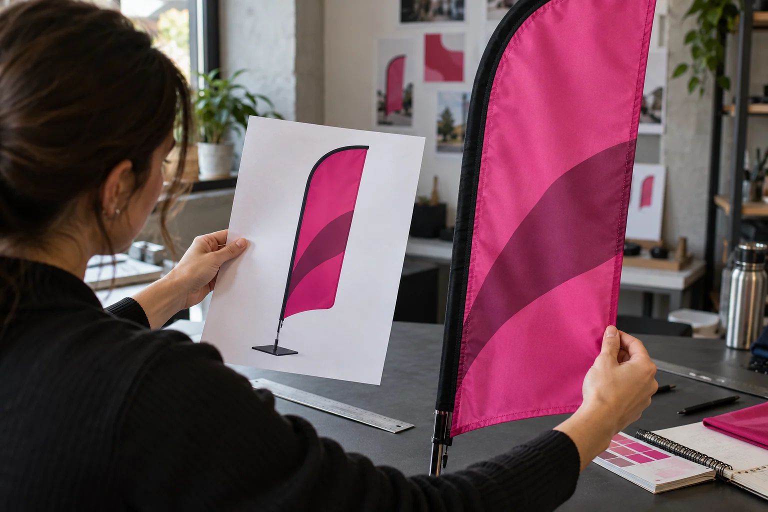
Choose the first thing people should notice
Decide whether the flag identifies your business or communicates one promotion. Make that element dominant, then remove details that do not support it. A short company name can be easier to read than several service descriptions. If contact information is needed, consider whether it belongs on a nearby fixed display where a visitor can pause, rather than on a moving narrow flag.
Design inside the supplied outline
Use the exact template for the selected pole and graphic size. Keep essential elements within the safe area and away from the sleeve or heavily curved edge. Do not build the artwork on a rectangle and assume it will be cropped without consequence. Compare the template with a visualisation at the intended display location so the design and product choice develop together.
Use deliberate contrast
Choose a clear relationship between the logo and its background and refer to the approved brand palette. Avoid filling every area with competing colours or small decorative elements. Check how the mark looks at a reduced size to expose weak hierarchy. Colour appearance on fabric still needs its own review; a vivid backlit phone screen cannot approve the final textile appearance on its own.
Prepare the file properly
Use a suitable original logo and keep it in an editable production workflow. Adobe explains that vectors scale without relying on pixel resolution, making them useful for simple logos and lettering. Ask the supplier to check photographic elements or raster graphics at finished size. Confirm language, spelling and orientation carefully. If the flag has independently readable faces, review both artwork layouts before approving production.
Test before you duplicate the design
Review the flag from the main approach direction, ideally using a proportioned preview or an appropriate sample. Ask someone unfamiliar with the campaign to identify the company and message quickly. Revise the hierarchy if the essential detail is unclear. Send the chosen SKU and approved design to Orient Uniforms FZE with the dimensions, quantity and display location so the final quotation matches the intended product.
Questions & answers
Should lettering run vertically on a feather flag?
It can be considered, but review readability and brand rules in the actual shape. A tall format does not require every word to be rotated or stacked.
Can a detailed photograph work on a flag?
It may suit some designs, but assess its print quality and whether it competes with the main message. Keep the logo clear and review the artwork at its intended size.